Data Collector Views
Collected data can be displayed tables, graphs, histograms, scatter plots, 3D scatter plots, pie charts and heat maps. These views can be selected from the Data Collector Tool group of the Measure ribbon.
Data Table
Click on Data Table to show data collected from all data sources in a table format. The table has a multi-tab layout with each tab representing a separate table.
Data collector tables can be saved and restored. This functionality allows you to collect and analyze data from multiple sessions in a single table. The data is saved with the "adoxml" extension.
Tables can also be exported to Excel (by clicking the Excel tool) or to text files as either tab or comma delimited formats.
The statistical panel can be activated using the Show statistics tool.
The Totals control defines the type of aggregate function calculated for every group. Groups can be aggregated by count, sum, average, minimum, maximum, or standard deviation.
Note that grouping can be based on multiple columns. Drag the column header of interest into the grouping box. In the example below data is being grouped by the collection number.
Data can be further sub-grouped by dragging additional column headers into the grouping header.
Block View
The block view table is designed to show the data for a selected collection from all data tables in a single view. If the tables contain a snapshot or other image column, the image will be shown in the block view. Select the Copy button to copy the table for the displayed collection to the clipboard.
Graph
The graph plots data values in a chart:
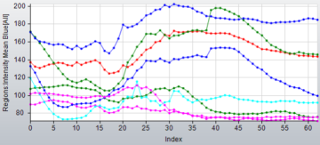
Select data columns to plot with the Y axis and X Axis combo-boxes.
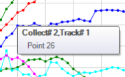
The graph tooltip shows the parameters of the data point under the cursor:
Histogram
The histogram shows binned data of selected measurements.
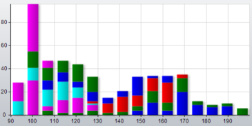
The number of Bins defines the granularity of histogram. When Per Collection or Per Item controls are active, the data is grouped, and every group has a different color (see details in Modes).
Scatterplot
The scatterplot shows the data distribution of 2 measurements. Note, only measurements from the same table can be plotted on one chart.
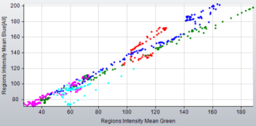
When Per Collection or Per Item modes are active, the data is grouped, and every group has a different color (see details in Modes).
3D Scatterplot
The 3D scatterplot shows the data distribution of 3 measurements. Note, only measurements from the same table can be plotted on one chart.
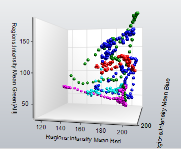
When Per Collection or Per Item modes are active, the data is grouped, and every group has a different color (see details in Modes).
Pie Chart
The Pie Chart displays a pie chart of the classes for the selected measurement type. The values in a pie chart series are grouped according to the Group measurement.
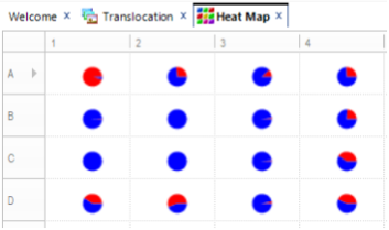
Heat Map
The heat map can be used to present data collector values in the acquisition layout with color coding of each measurement according to the value’s position in the range of values. When you select this option, the Heat Map ribbon is displayed. In the ribbon, use the measurement list box on the left to define the measurement to display. All data collector measurements are available for display. The Statistical Fields control on the ribbon define what is displayed if there are multiple measurements per collection or well. Available fields: Mean, StDev, Min, Max, Range, Sum, Index of Min, Index of Max, Count, Median, Pct10, Pct90, Plot, Histogram, Pie Chart.
When one of the charting options is selected in the Statistical Fields list box (such as Plot, Histogram, or Pie Chart) a mini chart of data for every cell is displayed. Pie Charts are shown in the example below:
The Layout group options on the Heat Map ribbon define how the table is organized. Data collected from a multi-well plate data set using Count/Size protocols can be arranged in a plate layout by selecting the Plate layout option. Otherwise, the table can be arranged by setting the number of Columns (Rows are calculated automatically).
The Cell Size is calculated automatically when the Auto option is selected, deselect this option to manually set the Width and Height of cells in pixels. The color scheme that is applied to the cells can be defined in the Heat Map group on the ribbon.
Coloring is only available for numerical data and can be defined by selecting the Palette tool. Select the Hide Text option to show only the color in the cells.
The Spectrum combo-box contains a list of predefined color palettes. When one of the predefined palettes is selected you can adjust the number of Divisions in the palette. The Divisions define the granularity of the palette.
The Type list box defines the type of generated color spectrum, which can be one of the following:
- RGB - spectrum in Red Green Blue space from Start color to End color
- HSI CW - spectrum in HSI space calculated in a clockwise direction of Hue
- HSI CCW - HSI spectrum calculated in a counter-clockwise direction
- Custom – a palette where you can add color bands manually
The Spins spin box defines the number of times the spectrum is repeated.
The Index control defines the active color band index. Use the Add button to add new band and Delete button to remove the active band.
You can define specific ranges for data coloring clicking the Ranges tool, which shows a sub-menu of additional options. When the Auto and Smooth options are off, you can define the range for heat map colors. The Count defines the number of ranges. The Spread can be used to automatically spread the values between the first and the last value by ranges, linearly. When the Smooth option is on, only the first and last values should be defined, the rest is colored using a smooth palette. When the Auto is on, the range is defined by the actual values in the data set.
Heat map options can be saved to, and loaded from, a file.
Note: If multiple data windows are opened, the selected cell in the Heat Map is synchronized with other chart windows, such as the Block window or the Pie Chart (when Show All is off). So, clicking on any cell in the Heat Map will display the complete data set for the given collection in the Block window.
Modes
When the Show All button is selected the data is plotted for all data blocks, when deselected, only the last data block is plotted.
The Per Collection button defines if every block will be plotted in a separate graph. When the option is deselected, all blocs are plotted on a single line. If the collection includes more than one type of object (e.g., tracks and line profiles), every object is plotted separately.
Per Item - plots the data per item in each block, the number of lines corresponds to the number of items in a block. This mode can be used to plot intensity data from different objects on a live image.